
This week’s assignment was to dive into the world of creating graphics, maps and surveys. I have done a few of these things, but I tried to use different creation tools this time around. Let’s start off with the map. I used ArcGIS and I am putting together a lesson plan to guide my students through it. The biggest downfall I found to the one I used was I could only attach one picture to the points I put on my map. My original intention was to create a slideshow under each point, but the software I used would not allow it.
It does however do some amazing things. Here is an example of what it can do. I should probably not show everyone this one before I show you my map, but it is pretty awesome so I wanted you to see it.
Coronavirus Map Example of what this site can really do (not my creation)
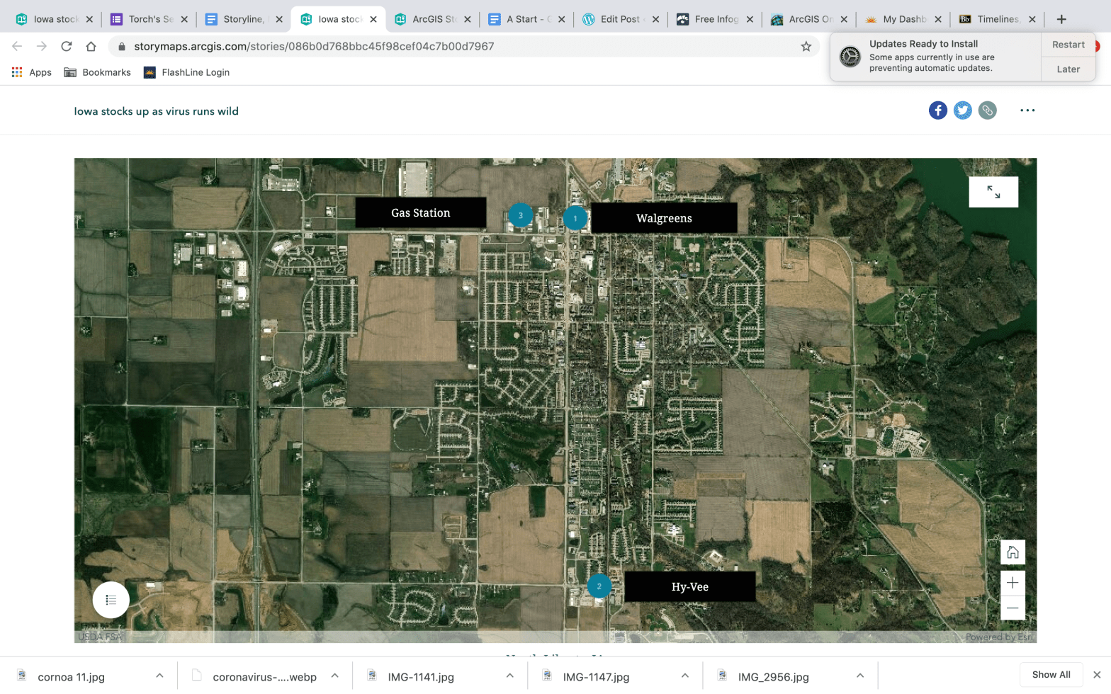
North Liberty, IA Map (my creation)
Creating the map was easy. If I was going to do it again I would want more data to plot. That would make it a little more comprehensive, but in a time when I was not really dying to go into multiple stores due to the Coronavirus pandemic I figured three was enough. So that is where I stopped. I could see this being a great tool for listing something like what seniors are doing after graduation. It could be used to plot spring break destinations or a number of other school related things. It would also be a great sports tracking tool. I could see using the map and posting player stats or team stats on it during a sports season or even listing the musicals happening in Iowa during the school year. I will be looking into maps with my students later this year if we return to school.
The second part of this assignment was something I have used before, but I needed some input on what to include in our senior magazine so this was a good way to do it. I used Google forms to create a short survey/questionnaire. I kept the questions multiple choice for the most part except for a couple that were short answers or prompts for students to submit their own. It has worked well so far, but we have not pushed out through the school social media so only a limited number of students have taken it. Below is a screenshot of the limited results. So far it is giving me a clear idea of what students want to see in the senior magazine. The last two questions allow students to submit their own material. This was my attempt at crowd sourcing some great photos for the magazine. Hopefully, it works.

If you want to take the survey or look at it online you can find it here:
Senior Magazine Survey using Google forms
The final element I completed for this assignment was a timeline. After my recent post about the violence in Cedar Rapids I decided to make a timeline of the events. My hope was to create something simple that could accompany an article or podcast. It was an easy element to create and there were plenty of different designs to choose from. I have already encouraged my students to create one for the Coronavirus and the schedule changes that have come with it.
I used the following website to create my timeline. All I had to bring to it was photos and evidence.
Here is my timeline for the recent string of violent events in Cedar Rapids.
All of these resources can add visual elements to any print or web article. They were easy to use and for the most part students will be able to handle the learning curve better than most adults. Check it out and put the kids to work. They will impress you with what they can do using these tools.
